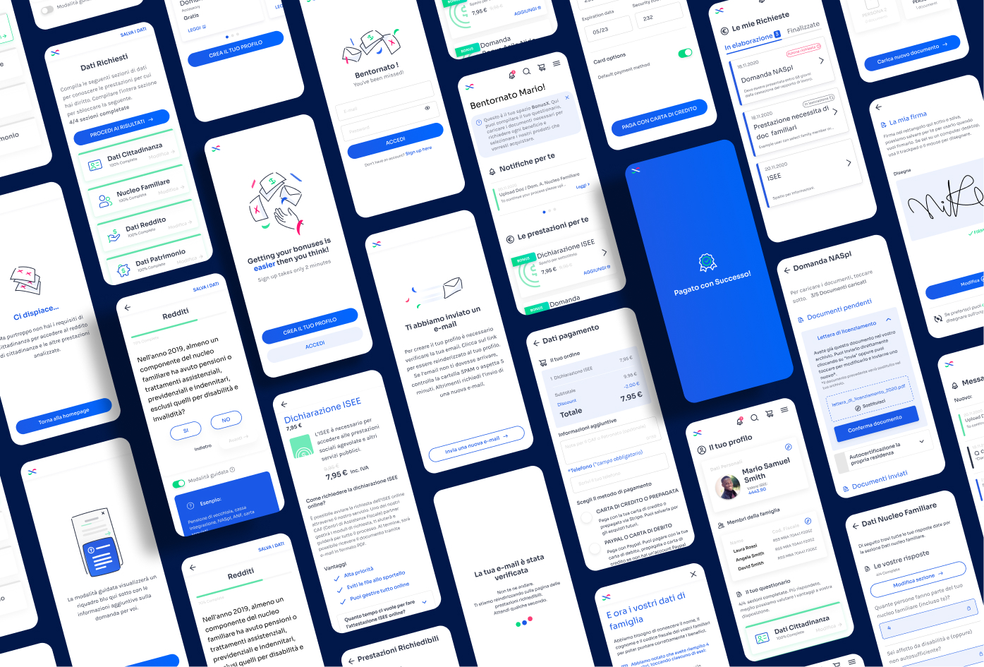
This is a Web app design project for an Italian platform that simplifies the process of discovering and requesting public subsidies. With a user-friendly interface, users can easily navigate and apply for these benefits while managing other practices like entering documents and signing forms.
The design features two interfaces - one for the final user and another for the operator who assists the user in the process and sends their file to the competent institution. The responsive design was crafted in Figma, ensuring the platform is accessible and easy to use on any device. I received the branding style guide and iconography but I had to work on some illustrations to compose some pages as well.
I worked in the big and complex UX of the platform, which englobes:
- A questionnaire in the beginning, before onboarding to better address/target the benefits and subsidies to the User.
- The User management dashboard and its multiple features: chat with operators; notifications; upload of documents; sign files; purchase services; checkout; etc…
- The operator dashboard; Also full of features to review documents and to communicate with the final User.
As a designer, I’m glad to have worked on a project that somehow helps out people to have easier access to public subsidies. This product has been live since 2020 and has already helped numerous users in their journey to access public subsidies in Italy.
View Showcase
You can have a look in the live platform clicking here.